Cracked, Crooked, and Completely On Purpose: The Case for Designing with Flaws
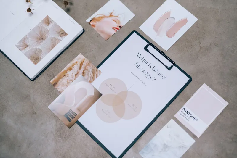
Scroll through any design portfolio site right now and you'll notice something strange. Everything looks... the same. Clean gradients. Rounded sans-serifs. Mockups staged on marble countertops. It's beautiful in the way that a hotel lobby is beautiful — technically impressive, totally inoffensive, and completely forgettable the moment you walk out the door.
Somewhere along the way, the tools we use to make things more efficient started making things more identical. And a growing number of designers, illustrators, and creative professionals are pushing back — not by chasing the next trend, but by leaning into something genuinely ancient.
Welcome to wabi-sabi. It's been around for centuries, but right now, it might be the freshest idea in American creative culture.
What Wabi-Sabi Actually Means (It's More Than Just 'Rustic Vibes')
The term gets thrown around a lot on design blogs, usually alongside photos of weathered wood and hand-thrown pottery. But the philosophy runs a lot deeper than an aesthetic mood board.
Wabi-sabi is a Japanese worldview rooted in Zen Buddhism that finds beauty in transience, imperfection, and incompleteness. The cracked glaze on a tea bowl. The asymmetry of a hand-stitched hem. The way a wooden table gets more interesting the older it gets. It's the opposite of the Western design instinct to fix, polish, and optimize.
For working creatives, the practical translation goes something like this: your rough sketch might be more alive than your finished render. The texture that showed up by accident might be the best thing about the piece. The thing you were about to correct could be the thing that makes your work unmistakably yours.
That's not permission to be lazy. It's an invitation to pay closer attention.
The Algorithm Problem Nobody Wants to Talk About
Here's the uncomfortable truth sitting underneath all of this: digital platforms have quietly trained us to make work that performs rather than resonates.
When you're optimizing for clicks, saves, and shares, you start making choices based on what worked last week. You gravitate toward formats that are proven. Colors that pop. Compositions that read fast. Before long, your creative instincts are being outsourced to engagement metrics — and the work starts to feel like it was made by a committee of data points rather than a person.
Wabi-sabi is, in part, a philosophical antidote to that dynamic. It asks you to make something that couldn't have been made by anyone else, in any other moment, under any other set of circumstances. That specificity — that irreducible humanness — is exactly what algorithms can't replicate and audiences are increasingly hungry for.
Chicago-based graphic designer Mara Okonkwo put it plainly in a conversation shared through her newsletter last year: "I spent three years trying to make my work look like what I thought clients wanted. Then I started leaving in the sketchy lines and the ink bleeds, and suddenly people were reaching out saying they'd never seen anything quite like it. The imperfections were the brand."
Intentional Imperfection Is a Skill, Not an Excuse
This is where a lot of people get it wrong. Embracing wabi-sabi doesn't mean shipping sloppy work and calling it philosophy. The difference between a deliberate flaw and a careless one is enormous — and experienced eyes can tell the difference immediately.
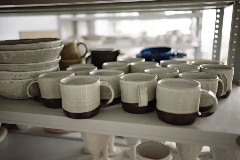
Think about the difference between a handmade ceramic mug from a skilled potter and a plastic cup that cracked in the dishwasher. One carries the marks of a human process done with intention and care. The other is just broken. Wabi-sabi is firmly in the first camp.
In practice, this means developing enough technical command of your craft that you can choose where to let go. You have to know the rules well enough to break them on purpose. A hand-lettered headline that looks effortlessly loose usually took a dozen tries to get right. A deliberately uneven layout still has to function. The asymmetry has to feel earned.
Portland-based brand designer Elliot Vasquez describes his process as "controlled surrender." He builds out a fully structured design, then introduces specific elements of disorder — a slightly misaligned grid, a texture overlay with visible grain, type that sits just a few degrees off horizontal. "It's like jazz," he says. "The improvisation only works because the structure underneath it is solid."
Where You Can Start Bringing This Into Your Own Work
You don't have to rebuild your entire creative practice overnight. Wabi-sabi is more of a perspective shift than a technique — but here are a few concrete places to experiment.
Save your process. Before you refine anything, photograph or screenshot the rough version. Sometimes that's the version with the most energy. You might not use it now, but it's worth keeping.
Try analog tools, even digitally. Scanning hand-drawn textures, using physical media for at least one stage of a project, or incorporating photography of real surfaces can introduce the kind of organic variation that software struggles to fake convincingly.
Let asymmetry work for you. Western design has a deep bias toward balance and symmetry. Try breaking that deliberately in your next project — not randomly, but with intention. See what happens to the energy of the composition.
Resist the last 10 percent. There's a point in most creative projects where you've essentially finished — and then you keep tweaking. That final polish phase is where a lot of the life gets sanded away. Try stopping earlier and sitting with what you have.
Build a reference library of imperfect things you love. Old signage. Worn book covers. Faded murals. Vintage packaging. These aren't just aesthetic references — they're examples of things that have accumulated meaning over time. That's what you're reaching for.
The Bigger Idea
At the end of the day, wabi-sabi in creative work is really about authenticity — the kind that can't be manufactured or optimized into existence. It's the mark of a person who was actually present while making something, who allowed the process to leave traces, who trusted their own eye enough to let something imperfect stand.
In a creative landscape that's getting more automated and more homogenized by the month, that quality is increasingly rare. Which means it's increasingly valuable.
The crack in the glaze isn't a mistake. It's the proof that a human being made this thing. And right now, that might be the most powerful design statement you can make.